Imagine that all the lights go out. You’re alone in a dark room, surrounded only by the glow of your phone screen. Sounds romantic? Maybe not, but it’s definitely easier on your eyes, right? That’s exactly how dark mode works – something that was once reserved for hackers but has now become one of the hottest trends in design. But is it just a trendy addition or truly the future of design? Let’s dive into the darkness (literally and metaphorically) and see what’s really behind it.
Why is it worth it?
There’s no denying that Dark Mode is currently one of the most popular trends in UX/UI design. But why should you actually implement this mode? First, dark mode is less straining on the eyes in low-light conditions. Remember those nights when you woke up to check messages on your phone, only to have your eyes bombarded by the blinding light of a white background? Dark mode is a savior in those moments.
Secondly, it saves battery life – especially on devices with OLED displays where each pixel is individually lit. The more black there is, the less energy is consumed. It’s pure physics, so if you’re a tech enthusiast and care about the environment, you already have a solid argument for dark mode.
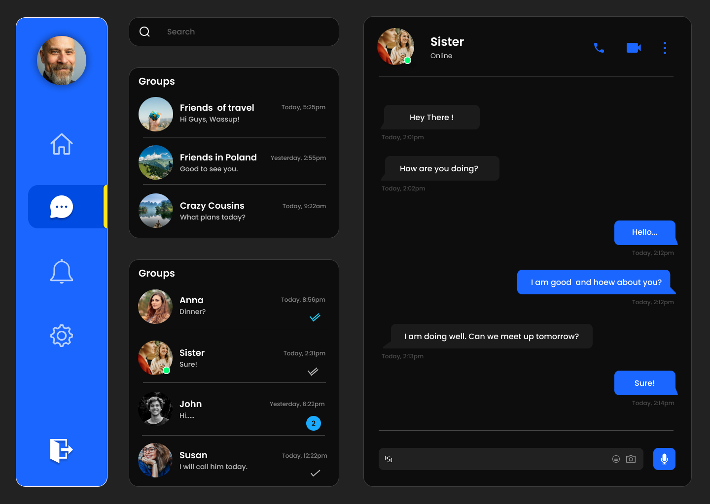
But it’s not just about comfort and energy savings. Dark Mode has also become a way to enhance aesthetics and stand out. Modern interfaces, especially in mobile applications, increasingly choose dark backgrounds to create a more elegant and modern experience. Brands like Apple, Google, and Spotify use dark mode not just to improve UX but to build an image associated with modernity and innovation.
The Dark Side of Dark Mode
But, like every story, even this one has its dark side. Dark mode can look great, but it doesn’t work everywhere and doesn’t always function as it should. The main problem is readability. Designers, captivated by black backgrounds, often forget about proper contrast for text and interface elements. Too low a contrast can make text hard to read, leading to user frustration.
An example of this is LinkedIn, which initially introduced dark mode without adequate contrast in some elements, resulting in user criticism. On the other hand, brands like Instagram and YouTube have successfully implemented dark mode, ensuring that each interface element is visible and functional.
A common mistake designers make is a lack of proper optimization. In dark mode, everything may seem more aesthetic, but without attention to readability, Dark Mode can actually be harmful to UX.
Dark Mode in Practice: Who Does It Well?
Which brands are doing it well? Let’s take a look at some examples:
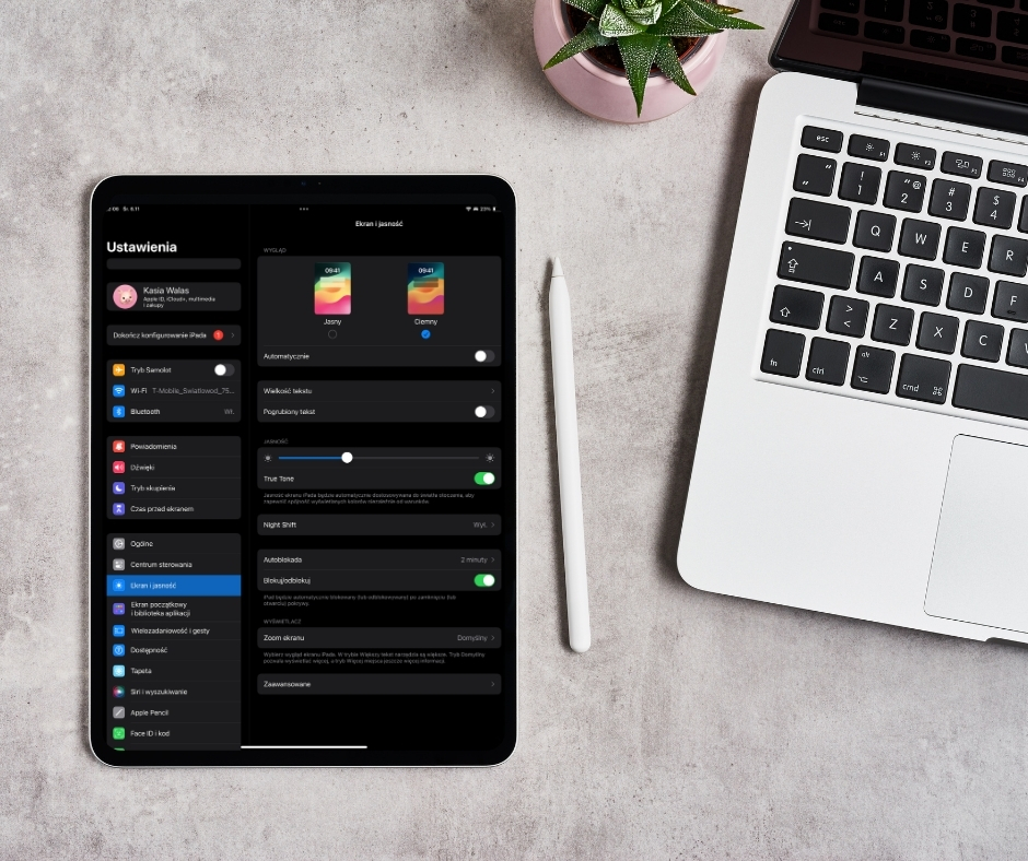
• Apple: Dark mode was introduced in iOS version 13, and the company has been refining it ever since. In native apps like Mail, Notes, or Calendar, dark mode works smoothly and aesthetically. With proper contrast and ergonomics, Apple demonstrates how to implement Dark Mode without compromises.
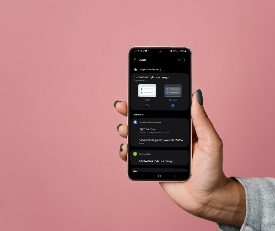
• Google: Android, starting from version 10, offers dark mode as one of its main system features. Moreover, apps like Google Maps and Google Chrome have also been optimized for dark mode, showcasing that it can be used across different contexts.
• Spotify: Dark Mode in this app is not only about aesthetics but also effective battery management. Spotify proves that dark mode can work well even in apps with a lot of visual and multimedia content.
• Netflix: Watching movies in dark mode is a natural choice, and Netflix has understood this perfectly. The platform ensures a comfortable interface for nighttime use without unnecessary eye strain.
How to Implement Dark Mode Effectively?
If you’re thinking about implementing Dark Mode on your website or in your app, keep a few key principles in mind:
1. Ensure proper contrast
Low contrast can make text hard to read. In dark mode, it’s essential that text and element colors remain visible, even against a black background. Don’t forget about users with vision problems – for them, the right contrast is crucial.
2. Give users the choice
Dark Mode is an option, not a requirement. Let users decide whether they want to use dark mode or prefer the traditional light interface. Top brands like Google and Facebook always provide the option to switch between modes.
3. Maintain interface consistency
Dark mode doesn’t just mean inverting colors. Interface elements such as buttons, links, and icons must be just as intuitive and visible as they are in light mode.
Is Dark Mode the Future of Design?
In a world where aesthetics, ergonomics, and functionality go hand in hand, Dark Mode is definitely more than just a passing trend. More and more people are using this mode, appreciating its advantages when using mobile devices and computers for extended periods. However, for Dark Mode to become a standard, it needs to be designed with the user in mind, not just for aesthetics.
Dark Mode is a solution for the future that requires thoughtful implementation. It must meet user expectations both aesthetically and functionally.
Conclusion
Dark Mode is undoubtedly more than just a fleeting trend. It’s a solution that has gained recognition from both users and designers and has the potential to become a future standard. On one hand, it minimizes eye strain and saves battery life, and on the other – requires thoughtful execution from designers. One way or another, the dark side of design is here to stay.
Ready to dive into the darkness?